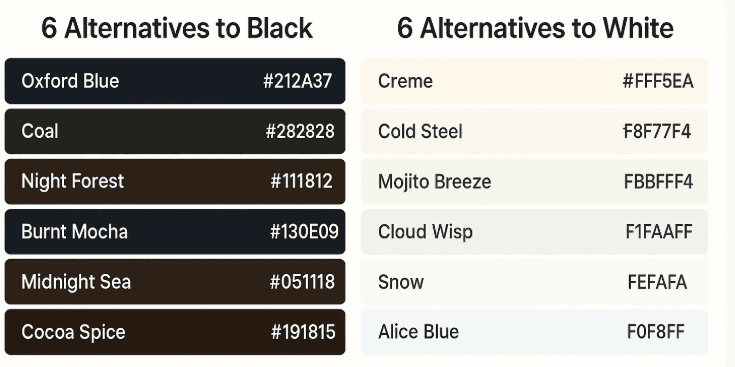
Web Colors: Alternatives to Black and White
🎨 Rethinking Your Web Page’s Color Palette: Ditch Pure Black and White
When designing a website, color is more than just decoration—it's a language. It sets the tone, evokes emotion, and guides the user experience. Yet, many designers still default to pure black (#000000) and pure white (#FFFFFF), unaware of how harsh and limiting these extremes can be.
It’s time to soften the edges and embrace nuance. Let’s explore why you should reconsider using pure black and white—and discover elegant alternatives that elevate your design.
⚠️ Why Pure Black and White Can Be Problematic
- Eye Strain: High contrast between pure black and white can cause visual fatigue, especially in low-light environments.
- Flat Aesthetic: These extremes can make your design feel stark or lifeless, lacking depth and warmth.
- Accessibility Issues: Pure black text on pure white background can create glare, making it harder for some users to read comfortably.
- Missed Branding Opportunities: Subtle tones allow for more personality and brand alignment.
🌑 6 Sophisticated Alternatives to Black
Instead of defaulting to #000000, try these rich, muted tones that maintain depth without overwhelming the eye:
| Name | Hex Code | Description | | --- | --- | --- | | Oxford Blue | #212A37 | A deep navy with a scholarly vibe—perfect for professional themes. | | Coal | #282828 | A soft charcoal that adds warmth and texture. | | Night Forest | #111812 | Earthy and mysterious, ideal for nature-inspired designs. | | Burnt Mocha | #130E09 | A coffee-toned black with cozy undertones. | | Midnight Sea | #051118 | A cool, oceanic black that feels modern and sleek. | | Cocoa Spice | #191815 | A chocolatey hue that adds richness and depth. |
☁️ 6 Gentle Alternatives to White
Pure white can feel sterile. These off-whites and soft pastels offer a more inviting canvas:
| Name | Hex Code | Description | | --- | --- | --- | | Creme | #FFF5EA | A warm ivory that feels luxurious and comforting. | | Cold Steel | #F8F7F4 | A neutral off-white with a hint of gray—great for minimalism. | | Mojito Breeze | #FBFFF4 | A whisper of green that adds freshness and vitality. | | Cloud Wisp | #F1FAFF | A pale blue-white that evokes clarity and calm. | | Snow | #FEFAFA | A soft, powdery white with a gentle glow. | | Alice Blue | #F0F8FF | A classic pastel blue that’s both nostalgic and clean. |
🧠 Tips for Using These Colors
- Pair Thoughtfully: Combine warm blacks with warm whites, and cool tones with cool tones to maintain harmony.
- Use Gradients: Layer similar tones to create depth and visual interest.
- Test Accessibility: Always check contrast ratios to ensure readability for all users.
- Let Content Shine: Use subtle backgrounds to let typography and visuals take center stage.